Abzu brand guidelines.
Go forth and do great things in our shared visual and spoken language.
Updated: July 2024.
Welcome!
The Abzu brand guidelines are in your hands.
Every element in these guidelines has meaning and purpose. How we apply our colors, illustrations, images, fonts, and tone-of-voice all reflect who we are and what we do.
You’ll find the necessary information in this guide to go forth and do great things in our shared visual and spoken language.
A beautiful brand that communicates and delivers a high-value experience requires consistent execution.
This is every Abzoid’s responsibility.

Jonas, Jaan, and Emil believe in you!
You can do it!
About Abzu.
Our vision.
👋 Put vision here.
Our mission.
👋 Put mission here.
The Abzu social contract.
- We are honest and we trust each other.
- We care for each other and respect our differences.
- Through collaboration, we boldly go where no one has gone before.
- We give and ask for feedback regularly.
- We have fun and spread positive energy.
The "About Abzu" boilerplate.
Abzu® unlocks discoveries in data, revealing insights that fuel innovation. Our proprietary explainable AI, the QLattice® is the cornerstone of our approach.
Abzu has offices in Copenhagen and Barcelona, and has received €13.3M in total funding to date. Abzu has been mentioned in Gartner® research, from Market Guides for AI Trust, Risk, and Security Management to Cool Vendor™. For more information, visit www.abzu.ai.
Our history.
November 2017.
In November of 2017, our seven co-founders met in the Spanish Pyrenees for a long weekend to create a business plan and a prototype graph search algorithm built in C called “LibAbzu.”
“Abzu” is an Ancient Sumerian word meaning “subterranean water,” with the additional religious context of “the source of everything.” Peremptorily, we define “Abzu” as “the source of the waters of wisdom.”
January 2018.
In January 2018, Abzu Aps was incorporated in both Barcelona, Spain and Copenhagen, Denmark.
January 2020.
Two years later, our founders had built a fully-functional algorithm running on a supercomputing cluster in a data center in Germany and named it “the QLattice®“.
Short for “Quantum Lattice,” our QLattice is a supervised machine learning method for symbolic regression inspired by the physicist Richard Feynman’s path integral formulation. Aptly, we called the Python library used to interact with the QLattice “Feyn®”.
Models produced by the QLattice have two unique advantages: They are readily explainable and easily interpretable, and they are high-performing, even with very little data.
April 2020.
Covid.
Due to the global pandemic, we shifted our full-release launch of the QLattice to an invite-only release with a select group of targeted users.
We spent the next year improving our algorithm performance, documentation, and user experience, and thinking about what industry(s) to focus our efforts on.
April 2021.
Our QLattice’s uniquely high-performing and explainable models filled an unaddressed gap between hypothesis-driven research and traditional machine learning techniques.
We began to disrupt domains previously dominated by black-box AI, like disease understanding and drug discovery.
Abzu received a record-breaking investment with a € 5.8M seed round. We signed agreements with several of the world’s largest pharmaceutical companies.
December 2022.
We were awarded a patent protecting the technology behind our QLattice.
Voice and language.
Our voice:
We are transparent. We communicate clearly and kindly, without a hidden agenda. This inspires trust.
We speak in a respectful and friendly manner because we believe everyone’s voice has the same weight. This encourages egalitarianism among diverse people and ideas.
We believe curiosity sparks creativity. We are passionate about learning and are excited by new ideas. We delight in teaching and inspiring others to understand and discover more.
We take responsibility for our words and actions. We are ambitious, but not blindly: We consider ethics in technology and its application paramount conditions for human and business value.
We are playful. We know that good work is balanced by good fun. Our sense of humor is evident in our words, images, and use of emojis. We are conspicuously approachable and enjoy playing games and having a good time.
Our language:
We use US English.
We use the Oxford Comma. There are no ifs, ands, or buts about this.
We never use all-capitals. Nice and curious nerds don’t yell.
We use sentence-case in titles and text and we speak clearly in complete sentences wherever possible. Therefore, we use fully-formed declarative, interrogative, imperative, or exclamatory sentences in titles, subtitles, and headlines, along with the correct punctuation.
We speak in full sentences wherever possible, including:
- Lists,
- Data labels,
- And similar items.
Check out typography for more information.
How we emphasize a point:
Text may be italicized for emphasis.
Bold is very strong, so use a semi-bold (a value of 600) whenever possible for emphasis.
Correct terminology:
- The QLattice is a new class of artificial intelligence.
- Our / your / their QLattice enables AI-powered scientific discovery.
We do not refer to the QLattice with the article “a” as the QLattice is a definitive entity that is known. We never refer to the QLattice without an article.
- QLattice produces explainable models.
- A QLattice produces explainable models.
“Black box” or “white box,” when used as compound adjectives to describe AI, are written with a hyphen.
- Abzu was born from the desire to challenge the fundamental assumptions of contemporary, black-box AI.
- Explainable white-box machine learning is the way forward in preeclampsia screening.
Abzu colors.
Primary colors.
#4646E6
Majorelle blue. The primary color for everything Abzu.
#FF1EC8
Hot magenta. The primary color for the QLattice and tech.
#109FDA
Spiro disco blue. The primary color for Pharma R&D.
#089C9C
Robin egg blue. The primary color for our culture.
#001580
Ocean eyes blue. The primary color for news and media.
#1A1A1A
Almost black. The primary color for text.
#FFFFFF
White. The primary color for backgrounds.
Gradients.
Achieved with a little CSS.
Start: #4646E6
End: #6F9CE3
Start: #FF1EC8
End: #B86A99
Start: #109FDA
End: #4189C0
Start: #089C9C
End: #4CC66F
Start: #001580
End: #7C4C93
Typography.
We use the Red Hat® font family for all our typography needs. There are no secondary fonts, as the Red Hat font family is open licensed under the SIL International license and is available for anyone to download and use.
The Red Hat font family is a sans serif font designed by type designer Jeremy Mickel for the Red Hat brand. Each character in the Red Hat font family is made up of perfect circles and straight, even lines. The effect is a geometric, rational, and engineered font with human touches.
Red Hat Display.
Red Hat Display is used in titles, subtitles, headlines, headers, and labels.
More often than not: Use Red Hat Display in bold weight (a value of 700).
Red Hat Text.
Red Hat Text is used in paragraph and supporting text. Red Hat Text characters have a slightly smaller x-height and narrower width than Red Hat Display, which improves long-form legibility. Because the characters are spaced generously and have thin joins, it performs great even at very small sizes.
Use Red Hat Text at Regular weight (a value of 400).
Red Hat Mono.
Red Hat Mono should only be used for code – programming or genetic – when a monospace font is more appropriate for character alignment or more technical use.
Use Red Hat Mono at Regular weight (a value of 400).
Google Fonts aren’t compatible with major email clients, such as Gmail and Outlook. In Gmail, in lieu of Red Hat Text, use “Sans Serif.”
Logo lockup.
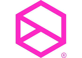
Our logo is a modest depiction of the QLattice at work. It portrays the simplest discrete path between multiple inputs to an output within a finite space.
The hexagon is regular – six equal-length sides with interior angles of 120° – and is positioned with a vertex facing upwards to suggest a cube or box. The white space enclosed by the hexagon illustrates the transparency of white-box AI.
The finite space enclosed by the hexagon is the environment in which inputs travel (left to right), undergo interactions, and emerge as an output. We represent this as a convergent path that follows the maximal diameter from the uppermost left vertex to the lowermost right vertex.
“Abzu” is written in all lowercase for a friendlier and more approachable aesthetic. The font is Red Hat Display, although we made a purposeful alteration to the top of the letter “b” to mirror the angle of the lower branch of the convergent path.
The safe zone.
The safe zone ensures that our logo is not placed too close to an edge or other objects. It protects our logo and provides visibility.
The safe zone is determined by the white space of the inner triangular area defined by the convergent path.
Primary logo lockup.
Secondary logo lockup.
Abzu's sign.
Using our symbol alone should be done sparingly and only when there is sufficient brand recognition or it’s obvious that the content is Abzu’s.
- As a favicon for an Abzu domain or an avatar for an owned channel.
- As a visual stand-in to refer to the QLattice.
- Along with supporting branding.
- As our logo on an external domain, or as a vertically-oriented version of our logo.
- As a visual stand-in to refer to Abzu.
- Without any supporting branding.
Primary sign.
Secondary sign.
Trademarks.
We trademark our intellectual property – text or sign – to protect our brand. Trademarks are a display of quality and trust, and they prevent confusion in a competitive and fast-growing marketplace.
Abzu owns 6 trademarks:
Trademarked text.
Abzu®
QLattice®
Feyn®
Reason®
QGraph®
Trademarked signs.

Protecting our trademarks.
To safeguard our trademarks, use the ® (“r ball”) at first mention at minimum.
- If the first mention is in the title, you can apply the ® (“r ball”) to the first mention in following text.
- If there is no following text, then you must apply the ® (“r ball”) in the title.


