Opening the black of AI with explainable AI (the QLattice). What does an explainable model look like? What does a plot look like?
Oh, hi! This blog post was written with a version of Feyn® earlier than 2.0.0. Results may vary! To stay up to date with the latest version of Feyn and all its functions, check out the Feyn changelog. If you’d like to recreate this with a newer version of Feyn and have questions, you can always use Abzu’s Discord channel for community QLattice® support or contact Abzu for commercial QLattice support.
When we have even a simple neural network like this, it’s a bit tricky to know what’s going on.
Each of these nodes have three to four inputs, so we can’t really visualise the innards in a satisfying way.
However it is much easier to see the inner workings from a graph that comes from the QLattice.
Graphs from the QLattice have nodes (which we call interactions) and edges between interactions. The graphs have inputs and an output with a natural flow from left to right.
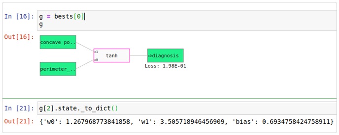
Let’s take an example! We will use the Wisconsin breast cancer dataset. This has thirty numerical features and a target feature called diagnosis. Either the tumor has been classified as benign (value 0) or malignant (value 1).
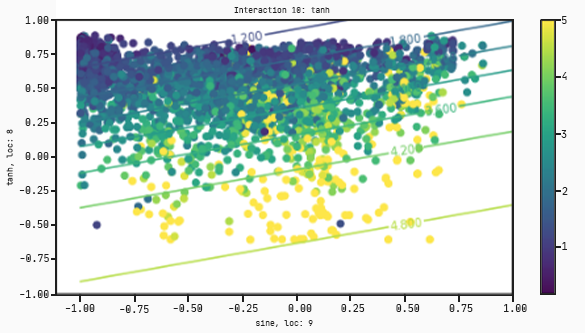
What are we looking at here? The tanh function takes the two features, one called concave points worst and the other called perimeter mean, which correspond to the little x1 and x0 on the tanh function.
The weights on the tanh function, w0 and w1, correspond to the variables of x0 and x1. This means that the output of the function is:
tanh( w0×x0 + w1×x1 + bias)
That’s all the graph does. The output of this function is the predict of the diagnostic on this dataset. We have two inputs and an output, so we can now make a plot!
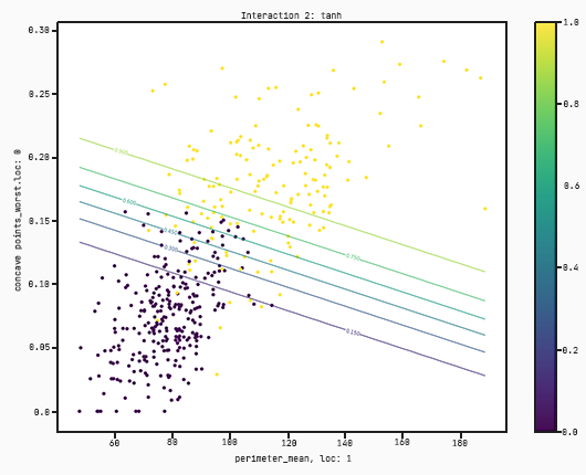
There’s a few things that need to be explained in the plot:
Each dot corresponds to a datapoint in the training set. The colour corresponds to the actual value of the target variable. In this case yellow corresponds to 1 (malignant) and purple to 0 (benign);
The x-axis corresponds to the variable x0;
The y-axis corresponds to the variable x1;
The scale on each axis the scale of each feature;
The lines correspond to the value of the output at the (x0,x1) coordinate. If a point lies on a line which has a value of, for example, 0.15 it means that the output of that tanh function at that point is equal to 0.15;
There’s a hidden standardisation going on here. The variables x0 and x1 correspond to the standardised features perimeter mean and concave points worst respectively. This means that the output of the tanh function is in fact evaluated at the standardised points. If this is a little confusing then don’t worry about it, we will discuss this at a later blog post point.
You can see from this model, it’s taking only perimeter mean and concrete points worst and then splits the data just using this. This loss is fairly ok but we can definitely do a bit better.
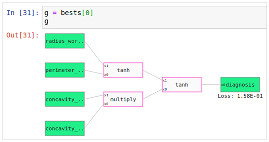
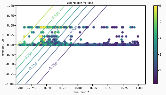
Let’s take a look at a more complicated graph but with a lower loss.
The two functions on the left hand side take the features as input and then outputs a value between -1 and 1. Then the function on the right hand side takes in these values between -1 and 1 and outputs a value within the feature range of diagnosis, which is 0 and 1.
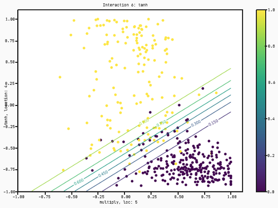
Let’s take a look at the charts.
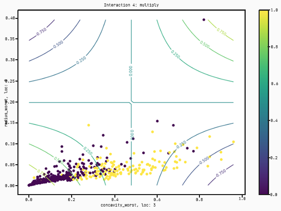
As you can see, this graph takes four features :radius worst, perimeter se, concavity worst, and concavity se. This time instead of just separating by concavity worse and perimeter mean, it’s found a better model that multiplies concavity worst and concavity se and then splits with respect to a tanh regression on radius worst and perimeter se.
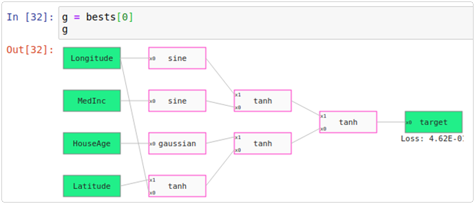
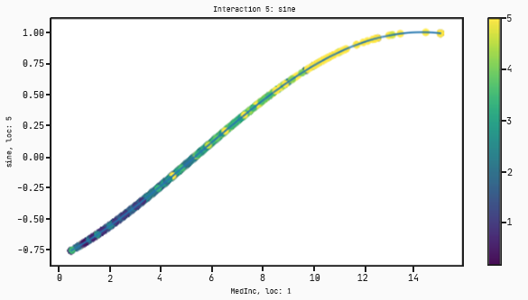
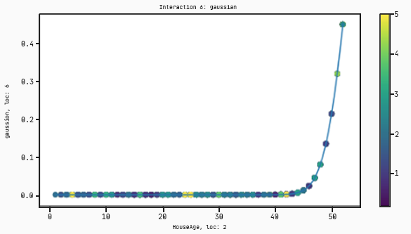
This also works with regression problems. Let’s look at the California housing dataset. In this dataset there are eight features to predict the price of a house. Here’s a particular graph:
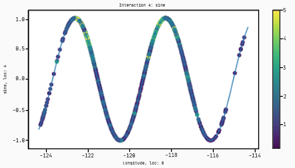
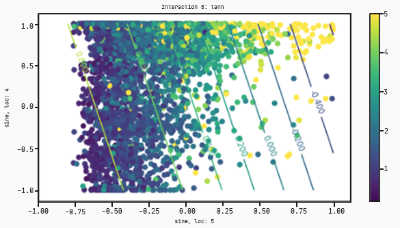
And here’s the collection of charts associated with it:
Now instead of splitting the dataset into two clusters this time, the model turns it into a regression from low prices (purple dots) to high prices (yellow dots).
In this case there are interactions that take only one variable. The plots for these will have the input on the x-axis and the output on the y-axis.
Here is the summary of the code for the California housing dataset.