If you’re not familiar with calibration but would like to know more about it before reading this post, make sure that you check our blog series about some of the tools that you can use to evaluate and improve the calibration of your model: An introduction to calibration (part I): Understanding the basics and An introduction to calibration (part II): Platt scaling, isotonic regression, and beta calibration.
In this blog post, we will show you some of the results that you might find when analysing the calibration of the models generated by the QLattice.
Training the QLattice and the calibrators.
In order to study how well calibrated the QLattice models are and to what extent calibrators can improve them, we chose five data sets, four of which have already been analysed in some of our tutorials: Titanic survival, Poisonous mushrooms, Liver cancer in plasma, Toxicity of antisense oligonucleotides, and Heart disease data set (from UCI repository).
As for the calibrators, we decided to test the ones that we introduced in our previous blog series: logistic (or Platt scaling), isotonic, and beta calibrators.
Concerning the training process, if the data set is big enough, the best thing you could do is to split a data set into three parts: Two train sets to train the model and calibrators separately and a test set to evaluate their performance.
However, when data sets are small, two other alternatives should be considered: You could either perform a two-level cross-validation (which can turn out to be quite time-consuming), or just go with two splits as usual (this is what we chose for the blog post). Of course, the latter might introduce some bias that could potentially affect the performance of the calibrator, as you would be training both the model and calibrator with the same samples. However, both of them would be tested on unseen data, so you would always have an unbiased evaluation.
Analysing three common cases.
1. Models that need no calibration.
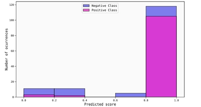
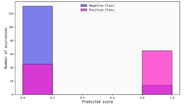
Overall, for the analysed data sets we found that the QLattice is able to generate models that are reasonably well calibrated, especially when squared error and binary cross-entropy are used as loss functions. A perfect example of this can be seen in the best models obtained for the Poisonous mushrooms data set.
Starting with the reliability diagram (generated with 5 uniform bins), we can arrive at two conclusions: The model is not only well calibrated, but it is also quite good at discriminating between classes.
In order to better see this, it is also convenient to plot a histogram of the uncalibrated scores, where it is possible to observe that most of the scores are (correctly) placed really close to the boundaries of the score interval. Thus, even if the score interval was divided into 5 bins, all of the scores fall into three of them, the first and last being the most populated (and most statistically significant) by a huge margin.
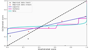
Calibration maps can also be helpful to understand the score transformations produced by the calibrators. You might find it useful to plot the mean predicted scores versus the fraction of true positives in the same graph (for both the training and test set).
This allows you to use the closeness of these points to the calibration maps as a measure of the goodness of the calibration. In this case, the transformations for the scores are quite good in the sense that they do not change the already calibrated scores around the extremes. However, it is true that there are no points to evaluate if the transformations would be good enough throughout the entire score range. In any case, it seems that this model does not need extra calibration, as the possible gains would be minimal.
This becomes clearer once we have a look at the metrics. As shown on the table below, the ECE (Expected Calibration Error) is low enough to consider that the models generated by the QLattice are well calibrated. The MCE (Maximum Calibrator Error) is also quite low, although significantly higher than the ECE. However, in this case, it is not extremely important and not that representative, as this value comes from a sparsely populated bin. Concerning the Brier score and log-loss, the obtained values also reinforce what has been said before, which is that this model is both good at discriminating and well calibrated.

2. Models that benefit from calibration.
A clear example in which calibrators do a nice job can be found in some of the models generated by the QLattice for the ASO data set when absolute error is used as loss function. As you can see in the reliability diagram below (generated from 5 uniform bins), the best model that comes out of the QLattice benefits substantially from applying any of the three calibrations methods.
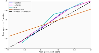
The calibration maps are also useful in this case to observe that the transformations are quite good, although we lack again information for middle area of the score interval due to the strong discrimination produced by the model.
However, the improvement in calibration can probably be understood better by checking the metrics below. It is clear that ECE and MCE become significantly lower when calibrations are applied, but also log-loss and Brier score, which means that the improvement in terms of calibration is at least good enough to compensate for a potential worsening in the discrimination ability of the model.

In the cases where calibrators have an impact, it might also be helpful to plot the histogram of the calibrated scores to complement the calibration maps. To provide an example, we show you here the histogram for the beta calibrated scores. As you can see, the calibrated scores for both the positive and negatives classes are significantly more spread than the uncalibrated ones, so in this case the beta calibration leads to a noticeable decrease in discrimination. However, this is not bad per se, as this shift also resulted in more “honest”, better calibrated scores, as suggested by the obtained metrics.
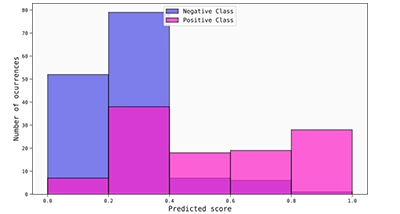
Histogram of the beta calibrated scores for the ASO data set (absolute error used as loss function).
Overall, we have found that calibration works best where absolute error is used as a loss function. Although this might require a more in-depth study, minimising absolute error seems to overpush scores to the boundaries of the score interval, so this could be the reason why we frequently get improvements when using a calibrator. Thus, if you were to consider minimising absolute error, we suggest that you check if your model provides calibrated outputs.
3. Models that are difficult to calibrate.
We have good news for you!
For the analysed data sets, we have not found any model (at least from the best ones) that we would consider to be uncalibrated or impossible to calibrate. As mentioned earlier, calibrators seem to do a good job for models generated when using absolute error as the loss function while minimising binary cross-entropy and squared error apparently leads to well calibrated models.
This somewhat makes sense, as these are essentially the proper scoring rules that are used to evaluate if a model is calibrated. As we have seen, low values of proper scoring rules usually suggest good calibration. (Don’t forget that they also take into account discrimination, though!).
In any case, it is possible that you might encounter models that are difficult to calibrate at some point. Some of the reasons why this can happen are that the signal-to-noise ratio in the data set might be too low, or that there is a huge imbalance between classes (although these are general problems that do not only affect calibration). Regarding the QLattice, it is possible that you might find ill-calibrated models if it is not trained long enough or with sufficiently high complexity.
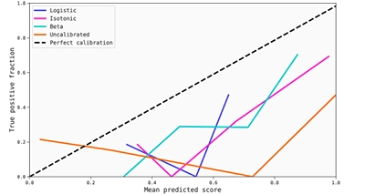
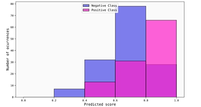
In order to give you an example of an ill-calibrated model, we decided to add some Gaussian noise to the ASO data set (only to the train set) and to reduce the number of epochs with which the QLattice is trained. This way, we would expect QLattice and the calibrator to have a harder time finding a calibrated model.
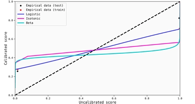
By having a quick look at the reliability diagram below, we can already perceive that the model seems to be poorly calibrated, and that the calibrators do not really perform a good enough job. This conclusion can also be derived from the calibration maps, as the score transformations do not work so well for the test set.
It is true, however, that the calibrators do improve the situation a little bit. If we compare again the histograms of the uncalibrated and beta calibrated scores, we can see that some gains are obtained, particularly with the true negative samples, as most of their associated scores are correctly shifted to the left. Nevertheless, it is clearly not enough.
This idea is also reinforced by the metrics, as they indicate an overall improvement when calibration is applied (but it is arguably insufficient). An interesting metric to look at in this case might be ECE, as it is easy to establish a comparison with the example from the previous section. Starting with an even worse calibrated model (0.49 vs 0.22 ECE), calibrators are able to provide a correction, although definitely not as good as before (0.18 vs 0.036 ECE for the best performances).

Of course, this data set has been purposefully modified to lead to ill-calibrated models, so we were expecting poor results. We hope that you don’t find anything like this in your future analyses, but if you do, now you will know how an ill-calibrated model might look and some of the reasons why this might happen.
To end the blog series, we have something for you!
As a tiny gift, we have decided to share with you a small Python package in which you can find most of the tools that we have used to write this blog post. You can download it here.