Welcome to calibration town.
What do the outputs of a machine learning classifier represent? Do they have any probabilistic meaning or are they just numbers that we can rank to classify samples into different classes? For many cases, these questions might be somewhat unimportant as long as the model provides decent values for metrics such as the AUC score or accuracy, but what if the predictions that we are making come with a future risk?
Let’s pretend you’re a doctor for the next couple of paragraphs (if you’re not one already 😅).
In particular, let’s pretend you’re a doctor who is in charge of assessing if patients might have cancer. Luckily, you have enough resources to perform all the tests that you want and gather other data from your patients. However, none of these tests seems to guarantee a reliable prediction, so as a last resort, you decide to feed all your data into a machine learning model and hope for something to come out of it. The bad news is that the model only provides two results: Either the patient has cancer, or he/she doesn’t. There is no in between. So…
If this is the only information that you have, how can you assign different treatments to each patient depending on how likely it is that they have cancer given their current metrics?
The answer is you can’t.
But wait a second… How does the model make predictions? Isn’t it supposed to use some kind of score and threshold to discriminate between classes?
Well, yes.
And… Couldn’t you interpret those scores as probabilities? That way you could clearly differentiate between low-risk and high-risk patients.
Unfortunately, probably not.
Evaluating calibration.
Common machine learning models such as Support Vector Machines or Gaussian Naive Bayes can usually provide effective classifications / discriminations, but the scores they output cannot necessarily be regarded as mathematical probabilities1. For this matter, these kinds of models are quite limited when decisions must be made taking into account their associated risks. In these cases, it might be much more desirable to work with probabilities than with just a binary classification.
So, when is it possible to consider the scores as probabilities?
In order to answer this, we should introduce the concept of perfect calibration. A model is perfectly calibrated if for every subset i of samples predicted to be of a class with score s_1, the proportion of samples that are actually of that class is s_1 too. Given this, it would be correct to interpret those scores as probabilities.
Well, and how can we know if this is happening?
Fortunately, there are many tools that you can use to measure how much your model deviates from the ideal case of perfect calibration. In the following sections, we will show you some of the most popular ones.
Binning.
Since model outputs are usually continuous, it is quite infrequent to have several samples with the same score; therefore, we usually resort to binning. In this case, we would have to compute the mean predicted score for the samples in each bin and determine the fraction of samples that are positive in each of them (from now on we will consider that the scores are associated with the positive class).
There are several ways to compute these bins, but the two most common approaches are uniform binning and quantile binning. The former consists of splitting the [0,1] score interval into n bins of equal width, whereas the latter generates n bins by splitting the scores into n quantiles. Thus, uniform binning is great if you would like to equally assess the calibration throughout the entire [0,1] interval, but it does not take into account that there might be some bins in which no or few samples will fall, making these bins statistically less significant than those in which plenty of data is contained. On the other hand, this is the advantage of quantile binning, as it guarantees that all the bins that you create are of similar size.
Reliability diagram.
Regardless of your chosen binning method, you can always plot the mean predicted scores and the fraction of true positive samples for your bins in order to obtain a reliability diagram (also known as calibration curve). Reliability diagrams are one of the best ways to visualise if your model is calibrated. As you can see on the image below: for a perfectly calibrated model, all the points should lie right on the diagonal (dashed line), as this means that for each bin the mean predicted score is equal to the fraction of true positive samples. Thus, the closer these points are from the diagonal, the better the calibration of your model is.
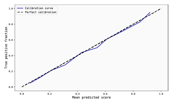
Reliability diagram of a well calibrated model.
It is also worth mentioning: In order to obtain an informative reliability diagram, it is important to choose the right amount of bins. This heavily depends on how big the data set you are working with is, how interested you are in ‘locally’ analysing the score interval, and how statistically significant you want your bins to be. Extreme cases might be helpful to understand this: if you decide to use a single bin, then you will have a highly populated, statistically significant data point on the reliability diagram, but it tells you nothing about how well calibrated your model is in different regions of the score interval. The opposite happens if you choose as many bins as there are samples in the data set, since the bins would have no statistical significance whatsoever.
A rather safe, common approach is to generate 10 bins (or 5 if the data set is small). This is of course a rule of thumb, so make sure that you try different possibilities depending on your needs and data availability. In this regard, you might find it helpful to plot a histogram of the scores in order to see how they are spread throughout the score interval.
ECE and MCE.
You might be wondering, “Where are the numbers?” After all, graphs are cool, but they are usually not enough. In order to numerically evaluate if your model is calibrated, one of the best metrics you can use is the Expected Calibration Error (ECE), which is the weighted average of the distance of the calibration curve of your model to the diagonal. So, if you have a calibration curve derived from M bins with |B_i| samples in each, for a binary classification problem the ECE is given by:
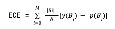
where ȳ(B_i) and p̄(B_i) are the fraction of true positives and mean predicted scores inside the bin B_i, respectively. Thus, ECE is a bounded (∈ [0,1]), easy-to-interpret, and powerful metric to assess if a model is well-calibrated on average.
Another bounded metric (∈ [0,1]) related to the reliability diagram is the Maximum Calibration Error, which is the maximum distance between the calibration curve of the model and the diagonal. For a binary classification problem, we have the MCE given by:
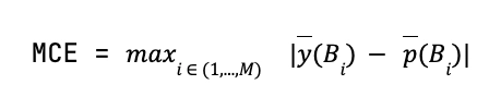
MCE is a useful tool to consider applying whenever we want to make sure that the model is not only well-calibrated on average, but also to know how bad the calibration can be in the worst-case scenario.
Of course, for both ECE and MCE, the lower their values are the better. However, and just like for any other metric, a metric value can be considered to be good or bad depending on the application of the model and its performance compared to other classifiers.
Proper scoring rules: Brier Score and log-loss.
ECE and MCE are really nice tools when the required task is to evaluate the calibration component of a model, as this is purely what they measure. However, they cannot be used as a metric to be minimised in the training process of a classifier. This is because it could cause the model to output trivial, useless scores, such as giving a score of 0.5 to each of the samples on a balanced data set. Such a model would be perfectly calibrated because it just learns the sample distribution of the data set, but it is of no use because it cannot distinguish between classes.
Thus, in order to train a model it is more useful to consider proper scoring rules, which are calculated at the sample level rather than by binning the scores. The advantage of these rules is that their value depends both on how well the model is calibrated and how good it is at distinguishing classes, so obtaining low values for a proper scoring rule means that a model is good at discriminating and is also well-calibrated. Unfortunately, due to this very same nature, proper scoring rules might not be sufficient to evaluate if a model is calibrated, so the best thing to do is to combine them with ECE and MCE.
The most common proper scoring rules are Brier Score, which is equivalent to the mean squared error for binary classification, and log-loss. Although both of them are frequently used, Brier Score is bounded between 0 and 1 (unlike log-loss), so if you are looking for an intuitive, easy-to-interpret, proper scoring rule, this might be the right choice for you.
What’s next?
Now that you are acquainted with the tools that you can use to analyse the calibration of a model, you might ask yourself what happens if you find a model to be uncalibrated. Luckily, you can actually try to fix it/improve it by using calibrators, which are some tools that are used to transform the scores from your machine learning model into something that is as close as possible to real mathematical probabilities.
If you want to know a bit more about this, make sure that you check the second part of this blog series!
References:
1. Niculescu-Mizil, A., Caruana, R. (2005). Predicting good probabilities with supervised learning. ICML ‘05, 625-632. doi: 10.1145/1102351.1102430